Designing for Everyone: 4 Simple Ways to Improve Website Accessibility

We hear that accessibility is important, but what does that mean? Accessibility can look different depending on your audience. When we talk about digital accessibility, many people immediately think of visual impairments. While that’s an important part of the conversation, accessibility also includes users with hearing, motor, and cognitive disabilities. Understanding your audience is key.
When your content isn’t accessible, you risk excluding a significant portion of your audience. Improving accessibility can lead to:
Better SEO
Expanded reach
Higher engagement
In this post, we’ll focus on websites, but many of these tips apply to email marketing and social media.
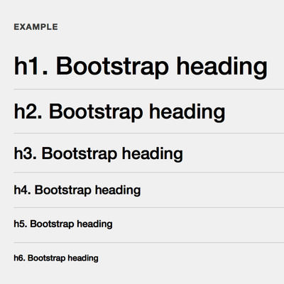
1. Use heading hierarchy for structure
Heading hierarchy creates a clear outline of your content, which is essential for screen reader users. Sighted users rely on visual cues like font size and weight. Screen readers rely on properly structured HTML (H1-H6) to understand how content is organized. If this is skipped, it can make navigation confusing or even unusable.
Using proper hierarchy
Helps screen reader users navigate quickly
Improves SEO
Creates consistency across your site
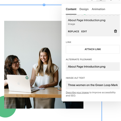
2. Write accurate and descriptive alternative text for images
Images often carry meaning that isn’t captured in text alone. Without alternative text, that meaning is lost for users who rely on screen readers.
Good alt text should:
Describe the purpose of the image (not just what’s in it)
Be concise but informative
Avoid using keywords only
For example, if you’re showing a before-and-after office renovation, your alt text should explain what changed.
It’s also important to note that PDFs can be accessible but only if they are properly tagged. Otherwise, screen readers may interpret them as images. Consider this when incorporating them into your website.
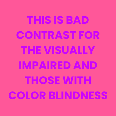
3. Use proper color contrast
Most professional designers tend to keep this in mind naturally. Now that design tools have become accessible to everyone, not just designers, it can be easy for this to be overlooked. Check out the two examples below. Bad color contrast can affect everyone. As you can see with example A, it’s pretty hard to look at. Example B can be okay for many people, but this would be incredibly difficult for the visually impaired and people with color blindness (and for those who are or are color blind, don’t worry, I included descriptive alternative text for these images!).
Avoid:
Light text on light backgrounds
Highly saturated color combinations

Another best practice to keep in mind is to avoid relying on graphics and text-based images on your website. Text within an image cannot be read by screen readers. If it can’t be avoided, make sure to include all of the information displayed within your alternative text.
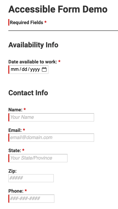
4. Make your forms accessible
If you have a form on your website, like a contact form, labels must be present and visible within each field for screen readers to pick up on. This tends to be one of the most commonly overlooked accessibility issues.
Every form field should have:
A visible label (not just placeholder text)
A clear association between the label and the input field
Helpful error messages and instructions
Accessibility doesn’t have to feel overwhelming. When it’s built into your process, it becomes much more manageable. Perfection won’t be achieved overnight. However, consistency, awareness, and improvement over time are what matter most. By being intentional and integrating it into your process for content, you can reach more people, increase engagement, and communicate with a part of your audience that can often be excluded.
Here are a few websites to help you in your accessibility journey!
WAVE - web accessibility tool
Multiple tools to help you evaluate your website
WebAIM
Checks contrast and color accessibility

Emily Newberry
ACCOUNT COORDINATOR